
What Heathkit Taught Me About Good UX Design
An Ode to the Favorite Company of the Early Electronics Makers

I try to do research for my articles. Or at least, some approximation thereof. While researching this one, I was surprised to learn that the subject company of the article, Heathkit, was still in business. So I had to revise my title a bit, which was going to be about how a “long-dead company” taught me things about good user experience (UX) design.
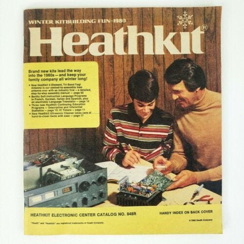
All apologies to Heathkit on that one. However, to be fair, it did go bankrupt in 2008 and was dead (to its kit customers at least) for a while. But as Miracle Max might say, it turns out our friend here was only “mostly dead”. Heath staged a comeback after restructuring in 2013. They reorganized, restarted, and are selling their signature electronic DIY kits again! And I hope it all goes well.
I also hope the new incarnation of Heathkit lives up to the older one, which for me set the bar for how a company invests in making their customers succeed. Their motto has always been “We Won’t Let You Fail”, and in my experience in the 1970s and 1980s with their products, I found it to be true. I built many of their kits and despite my questionable electronics knowledge and soldering skills of the time, never ended up with a brick.
The Original Maker Age
Heathkit traces its origins back to 1911 and was originally a light aircraft company founded by Edward Bayard Heath. Heath died in 1931 during a test flight of one of his aircraft, and his company went bankrupt. The company and the Heath name was later bought by Howard Anthony, who in 1947 started selling electronic kits to the growing community of ham radio and electronics enthusiasts of the mid-20th century. In a strange coincidence, Anthony also died in a plane crash in 1954, but the Heath name and Heathkit company lived on.
As I talked about a little in my Radio Shack article, Ham Radio and its enthusiasts were the original Makers, experimenting with new technology and building projects from kits and from scratch in their homes. This amateur radio scene was in full swing by the 1950s and through the 1960s, with Heath supplying a wide variety of radio equipment kits. By the 1970s (which is when I first came to know Heathkit) the company had branched out from radios into new product kits as well, including weather stations, alarm systems, and eventually, computers.
My Cat Hated Heathkit
Throughout the 70s and 80s I built (or helped build) various Heathkit projects, including an alarm system cleverly disguised as a book, a wind direction / wind speed weather station, and (helping a neighbor) eventually the ET3400 Computer Trainer, which was an early Heath’s foray into computer kits.
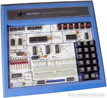
I still remember how exciting it was when we finished the ET3400, and turned it on and saw the LED display reading “CPU UP”. It was always very satisfying to finish any kit and see it come to life after all the effort and care you put into building it.
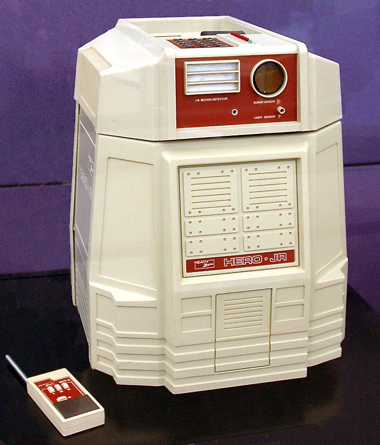
When I graduated college and started work, one of my early paychecks went to Heathkit, to buy the HERO Jr Robot. My alarmed family gently reminded me that I should also consider actually getting out and meeting other people and not stay in my new apartment building robots, but for nerdy me this was a very high priority, given how long I’d spent ogling things I could not afford in the Heathkit catalog.
I did leave the apartment and meet other people eventually, but not before completing this (as it turns out last) Heathkit project. I named the robot “Shithead” (my elegant way with words obviously goes way back) and assigned it the duty of keeping my cat Donovan in line. The cat was named after the singer of the song Mellow Yellow, because he was both similarly tempered and colored, but he also had the unfortunate habit of sharpening his claws on the drapes.
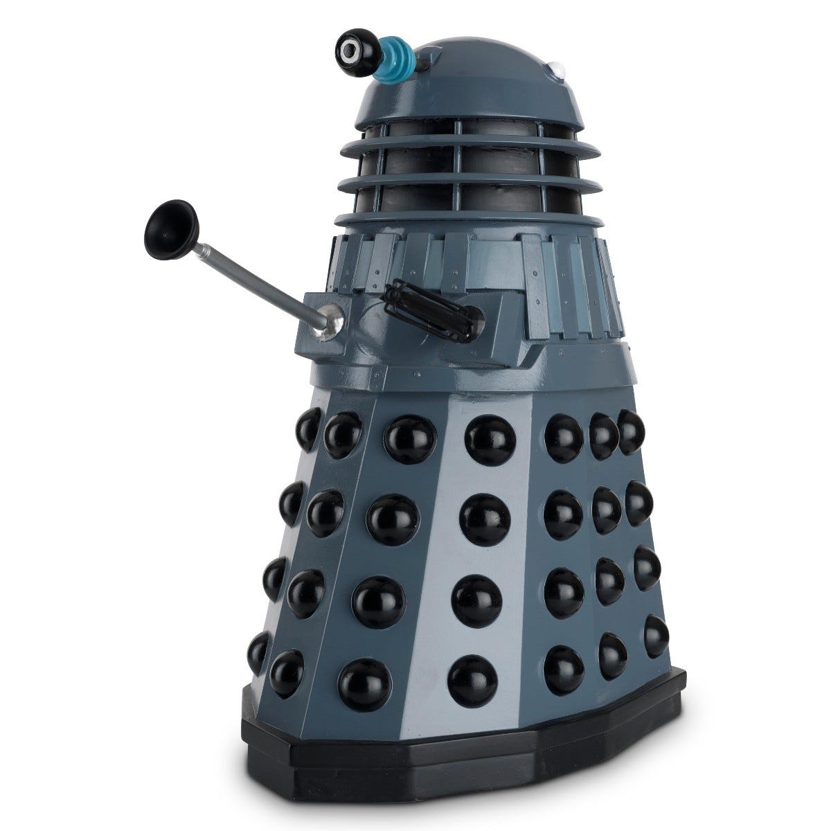
Shithead was outfitted with a squirt gun powered by an electric motor which was connected to a relay and wired to the only spare channel of the Hero Jr remote. I could pilot the robot into the living room and target the cat remotely when he was getting near the drapes, and eventually, just the sound of it entering the room would deter his bad behavior. All in all, I think the robot ended up more like a Dalek than the vaguely R2-D2 styling Heathkit was going after.
My Questionable Robot Building Skills
Yeah, a scratching post probably would have been cheaper. But then I would not have had the joy of building this great project and getting it to work! This is where we finally begin to talk about UX design. User experience is frequently associated with user interfaces for hardware or software, but it is a broader category than that, and covers the entire experience a user has when interacting with a product, from start to finish.
Heathkit took user experience seriously. This dedication to customer success manifested itself primarily through Heathkit’s instruction manuals, which were incredibly detailed and well-thought-out. Heath’s manual covered not just how to build their kits, but also how to troubleshoot and fix them if something went wrong.
Shithead for instance had issues. In my excitement to get it finished, I rushed through the build and ended up installing some components incorrectly, and the robot did not initially work. Since there wasn’t exactly a robot repairman I could call, the project would have been one expensive end-table if I could not fix it myself. Luckily, Heathkit was there for me.
The documentation for the HERO Jr contained detailed schematics and test measurement points, and information on what voltages and signals should be present on the various boards of the robot. This allowed me to narrow down the problem to a diode installed backward, something easily corrected. When I reinstalled it the right way, the robot sprang to life. I was delighted! Donovan was not.
What UX thing I learned here is something about taking into account the idea that your users make mistakes, and even if those are not your fault when creating a product, doing something to help them is always appreciated.
My Questionable UX Design Skills

For various reasons, I did not build many hardware projects for a while after that, (probably because I was getting more than my share of hardware projects at work), and I kind of lost track of Heathkit. They were bought by Zenith and tried to sell computers, with the same results as Radio Shack: eventual bankruptcy.
I continued to think about Heathkit long after they had disappeared as a company, especially later in my career when I was working on things like user interfaces for software we were developing at work. I have zero formal training in user interface design and probably should not have been allowed to make unilateral decisions about how parts of our GUI looked.
The same goes for writing user documentation, I am not a Tech Pubs guy but often find myself doing it. These situations seem to crop up often in my career, when products need to get out, the right people to design interfaces or write docs are not around, and R&D is left to the task.
In these situations, I do my best, and often take inspiration from what Heathkit has taught me. Here are a few of those ideas I try to keep in mind when creating something users will interact with.
1. Novice-Friendly is Always Appropriate

Even though the majority of Heathkit’s customers were probably experienced builders, they would always take time to include basic instructions for beginners, such as soldering technique. Experienced builders could just skip right over that page, it was never really annoying to see information you already know in the instructions.
There is an expert-friendly UI design school of thought that goes “you are only a novice once”, suggesting it's OK to create software that is hard to learn if it makes the experienced users more productive. I don’t buy this. If Heathkit taught me anything, it’s that Novice and Expert friendly do not have to be mutually exclusive. You can have tutorial modes and tool tips and basic versions of a UI for beginners without sacrificing expert productivity, for instance.
And these novice-friendly modes are worth investing in creating for your product, because although your customers may only be a novice once, that once is the first impression that will decide whether they come back again and again to your product, or move on to someone else’s.
2. Not Everybody Likes To Do Things the Same Way
This one seems super-obvious. But is it? I’ve gotten into arguments with other developers at work in the past about whether or not we need to make a feature available in more than one way - say on a menu, even though there is a key binding. Or on a toolbar button, even though the feature is also on a context menu.
The idea of streamlining user interfaces and reducing clutter is valid, and it is definitely possible to add too many buttons to something. But typically I see the thinking go the other way when an R&D guy designs a GUI. When coding, redundancy is a no-no, so having redundant ways to do things in a UI is sometimes avoided too much by a developer-turned-UX-designer. But people are all different. There are key-binding people and menu people and toolbar people out there, and providing a range of options for a function is useful, even if they all do the same thing.
Where Heathkit comes in here is again, with their instruction manuals (which are essentially their user interfaces). I was always impressed for instance that they would supply redundant circuit info, such as illustrations of an assembled board, X-Ray views of the traces of the board, schematics of the board, silkscreened information on the board itself to locate components, and written lists of components and testpoints.
A subset of these only would be needed just to assemble and test their kits. But by providing more than they needed to, they enabled a wider set of customers to succeed with their products.
3. You Can Never Have Too Much Documentation
Heathkit’s assembly instructions were very extensive, often 50 pages or more, sometimes with small helpful illustrations inlined with the assembly checklist. They always contained some beginner-oriented material as mentioned previously, but also even within the assembly portion of their manuals, the text descriptions were very detailed and comprehensive. (If there was an opposite to an IKEA instruction set, it would be Heathkit)
If you knew what you were doing and had no issues, probably a lot of this material could be considered superfluous. But even an expert builder would run into trouble sometimes, and having a highly detailed set of documents to describe how things should work greatly benefits beginner and expert alike, even if there is redundancy there.
I know for instance I would forgive a lot of repeated or long-worded descriptions of how a product works, if the documentation succeeded in helping me use the product the way I wanted to. As long as the information is not conflicting or confusing, I think what I took from Heathkit was that you really can’t have too much documentation, and I try to keep that in mind when writing user documentation myself, being generous with descriptions, examples, and details.
4. Your Customer’s Problems Are Your Problems

Finally, I would highlight the Heathkit motto of “We Won’t Let You Fail”, which should in truth be the motto of every company. Heathkit almost always included detailed troubleshooting instructions and test information for their products, and as a last resort even offered a repair service where you could send in your botched project to be fixed.
It wasn’t like Heathkit was the only company to create DIY kits, they had many competitors over the years. But what made them stand out was the mindset they had about what they were selling. It wasn’t just that they just sold DIY kits. They sold the experience of successfully building them.
There is obvious wisdom in that idea of selling the experience of success to customers, and not just a product meant to achieve it. And that philosophy can be applied beyond the world of DIY hardware kits to the software world as well. We could for instance talk a bit about how the troubleshooting part of Heathkit’s manuals has analogs in software having to do with producing better error messages and input checking for user interfaces. (Certainly a good topic, probably worth another article.)
But the customer success experience idea is something that spans beyond just one thing like handling user errors. It is about making things easy to learn, and useable by a wide variety of people with different preferences and levels of experience. About going the extra mile to explain things, and not making assumptions about whether or not someone already knows what you are talking about. It’s about being there for your customers when things go wrong, and providing ways for them to get back on track.
Maybe Heathkit will grow and regain (or even surpass) their former glory, or maybe not. Whatever the case, these lessons we take from their past are valid ones, and worth repeating. Also I do kind of hope Heath gets around to making a new robot. Because I have another cat, with a few bad habits.
Explore Further
Next Time: A look back at a dark time in my career, when I worked on a team that was so siloed that the design and implementation parts of the job were done by different people, who rarely talked to each other. A spooky tale that missed Halloween coming up in: When the R from R&D goes missing
The Mad Ned Memo covers topics in Computer Engineering and Technology over the past 40 years. Sign up and get nerdy tales and discussions of computing’s past, present, and future delivered straight to your inbox, and never miss an issue! (See the link for a sample selection of past articles) The Mad Ned Memo is cost-free and ad-free, and you can unsubscribe at any time.
The Mad Ned Memo takes subscriber privacy seriously and does not share email or other personal information with third parties. For more information, click here.